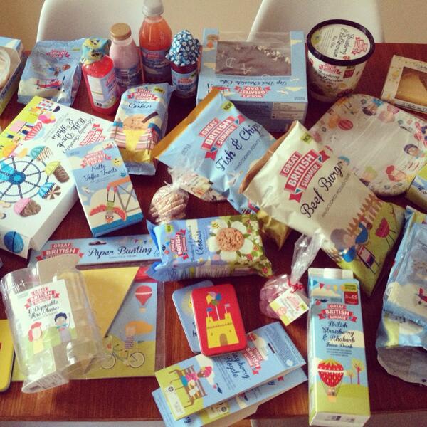
So I have been inspired this week by the beautiful packaging Kate Larsen has been designing for M&S's "Great British Summer" range.
Her designs are being used on a wide range of snacks, cakes, desserts and food featuring scenes of the british summertime including hot air balloons, beaches, fairgrounds and beach huts.
The illustrations are super beautiful, and I love the way she has incorporated food into them, biscuits riding a ferris wheel etc.
I got a little inspired and made this colour palette to work from and create some "Great British Summer" themed patterns:
Also I downloaded an action for rounding corners on images which makes them look swish and also hopefully harder to steal (;
Let me know what you think! Has anyone else been inspired by any packaging/artwork they have seen recently?


WAVING A BIG HELLO! from the middle of the United States :-D So glad we connected through Linkedin. I really enjoyed looking through your blog and can't wait for the next post!
ReplyDelete