Showing posts with label process. Show all posts

Thursday, 5 January 2017

52 Steps From My Front Door

      I have loosely started a 52 week photography project. I say loosely because I am not sure how long it will stick, I have tried these things before and it doesn't usually stick! This seemed like a good one to do though because it is one photo a week, with very loose themes, and a week is probably long enough for me to get something in rather than daily.
      Anyone looking to perhaps join in on this the group I am part of is here and the different themes for each week are below:


      Week 1 is titled 52 steps from your front door, I spent my new years day feeling very lazy with a bit of a cold. I finally left my house to go for a walk and stretch my legs around 8.30pm. I took my Pentax K70 with 50mm f1.8 lens to see what I could get wandering around in the evening. 


      I started with some fairly mundane photos of the streets, the shadows on the walls lit by street lights really intrigued me. 


      I live near an army reserve centre which is well lit. I thought all the shadows were very interesting so I wanted to have a play around with the multi-exposure feature on my camera. You can blend a huge number of photos but I stuck with 2/3. I have found it works very well with high contrast subjects and strong shapes.


      Playing around more with combining different subjects, pavements and houses!


      I love the depth you get in these images, but they were all quite abstract, seeing the bokeh effect from the street lights and car headlights I wanted to see what I could do with it.
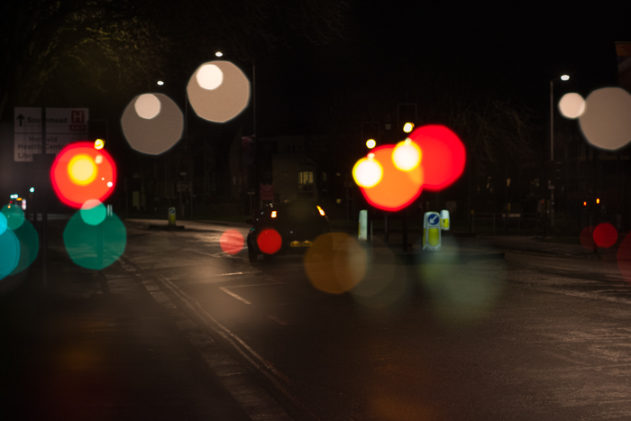

      Switching to manual focus I was able to overlay shots with in focus cars and lights with out of focus bokeh patterns. These also had quite a dreamy misty effect.


      These two are my favourite but the above didn't quite make the cut because the trees looked very soft where I had overlain the same scene defocused. My chosen image below seemed to have the nicest composition of those I took, the road leads you into the image into a sea of bokeh lights with some sharp elements poking through behind.


       I am quite happy with how this set of photos developed, next weeks theme is "sun" so I imagine I will end up with something completely different. Still, I like looking back on my process and seeing an idea develop. Is anyone else starting new projects in the new year? Feel free to share in the comments! I love to see these things!


Thursday, 10 July 2014

HOT14 Plymouth 3D Design Show

Apologies for the late running of these posts, the show is long gone now as I have spent the last two weeks moving house rather than updating my blog with photos!

Still- for all those who didn't get to go to the degree show here are some pictures of the 3D design section. I have always loved  the more crafty side of 3D design. There are always some very unique pieces of furniture, lighting and jewellery in this show, these are some of my favourites.

If you know any of the artists do let me know and I will update this with credits.


This was a branding solution for gandy's flip flops - I just love the liberty print ones and wish I had all the monies in the world for these and some liberty print nikes!


Cheeky self portrait


Let me know what you think of these? What designs are your favourites?

Thursday, 3 April 2014

The Girl and the Bird

My course leader Ashley Potter from Plymouth University has been running a project to investigate how different people tackle illustration work and how this may relate to their personalities. 

The project was entitled "Girl & Bird" this subject has been tackled many times in the past in all different ways and we were asked to interpret it however we liked, and then answer a questionnaire about our work which involved questions about ourselves, the work we did and about our personality types. 

I used this project as an opportunity to do a "real" illustration project, after months away from university I have found myself spending much less time on research and drawing development in the work I do and I wanted to push myself further in this one to try and create something exciting.


I used Pinterest to collect a variety of images to inspire me. Since I started learning aerial hoop I have been collecting different poses to motivate myself and I found myself drawn to the idea of including this in my work for this project as the grace and elegance of aerial artists posing in hoops reminds me of birds sat on branches. 


The first aerial girls I drew were ok, I found myself reverting back to the style I used when drawing the circus characters for my final year project. Whilst the facial expressions for that worked well, I wanted this girl to look less juvenile and more sophisticated.


After researching pierrot makeup and fashion illustrations I spent a while experimenting with different face styles in the drawings shown below. 


I much preferred these to the simplistic expressions I used to use and decided to carry this as a theme within the bird character. My first birds were fun, but rather fat :


I developed these using longer, curvier lines and more sophisticated faces, I wanted them to look more like birds of paradise.


For my final piece I chose a hanging pose for the girl on the hoop as I really liked the pose, I decided to use textured watercolour paper as it gave the line work a rougher style.


After scanning the drawing in I coloured it using Photoshop, I chose a palette of bright, fun colours to fit the fantastical theme, I was very happy with it and I hope to put prints online soon!


Monday, 18 November 2013

Christmas Fayre Poster - Hand Drawn Type

I have seen a lot of beautiful posters about recently using hand drawn type mixed with illustration to give a more "hand made" style to the events they are advertising. This works especially well when it comes to advertising craft fayres as the whole premise behind these events is buying into hand crafted goods. I find hand drawn typography to be a lot more charming and interesting to look at than standard fonts. 


I have wanted to make a poster like this for a while now so I jumped at the opportunity to help out a friend who is running a christmas craft fayre in Chippenham to raise money for a local charity on 21st December. Check out the event page here.

I thought I would go into a bit about my process when it comes to hand drawn type. I usually loosely sketch out a composition of what my piece of work will look like. I am no graphics/layout expert but generally just looking at the shapes of different letters and words and seeing how they fit around each other helps when working out a composition.

To come up with the different type styles I usually use dafont.com where I will look at a variety of fonts before choosing one and experimenting with drawing it out in my own style with different drawing implements. It usually ends up with the text being a hybrid of the chosen font and my own style due to the different tools I use. 

One tip I have for hand drawn type is to experiment a lot with your tools. I prefer my designs to have different line weights and textures as I think it looks richer and more interesting. This is a small selection of what I use for type:


Graphite sticks for example have a really great grainy texture and chunky ones can easily be manipulated to create different thicknesses of line.


These presents are drawn with 3 different thicknesses of fineliner.


For this I drew out my design roughly in the chosen fonts in pencil before going over with various types of pen/graphite pencils. Here is the scan of the finished design:


I then went into Photoshop to tweak the composition, retouch because am not the neatest of artists, and add colour and layers of texture. Here is the final result:


I enjoyed this project, hoping I can do more like this in the future! Feel free to share your own hand drawn type projects, I love to see what people are working on :)


Monday, 2 September 2013

Giftware Inspiration

This past week I had some time off of work and have been all around the country, visiting some uni friends in Plymouth, family in Cornwall and then up to Birmingham today for the Autumn Fair trade show! This post is just a few photos of some of the lovely things I stumbled upon!

I went with my family to Port Isaac, a seaside town in Cornwall where they film the programme "Doc Martin" (if you like random trivia). There were loads of gorgeous little gift shops including a pottery gallery in this amazing building:


Where you could look down over from the top level into the space below. They had some amazing hand painted pottery.


There were also loads of beautiful gifts and decorations:


And today I went to Birmingham for my first ever trade show (as a visitor rather than exhibiting) to see what it was all about and get inspired by other peoples work.

The NEC in Birmingham is a huuge place, there were 5 halls filled with all sorts of commercial goods, mainly types of giftware, greetings and homeware. I stumbled upon some fun things, and we also watched a popcorn making demonstration and found a dinosaur! 

All in all a very fun day with too many amazing things to see and take in at once, some beautiful displays with varying levels of sparkliness and lights, suck uk was quite extreme:


T-rex!


Dancing sandyclaws!!!


Oh and a little inspiration for any fellow graduates who are freaking out about life right now, if this is too cringy just imagine Dory from Finding Nemo "just keep swimming" ;)