Monday 18 November 2013

Christmas Fayre Poster - Hand Drawn Type

I have seen a lot of beautiful posters about recently using hand drawn type mixed with illustration to give a more "hand made" style to the events they are advertising. This works especially well when it comes to advertising craft fayres as the whole premise behind these events is buying into hand crafted goods. I find hand drawn typography to be a lot more charming and interesting to look at than standard fonts. 


I have wanted to make a poster like this for a while now so I jumped at the opportunity to help out a friend who is running a christmas craft fayre in Chippenham to raise money for a local charity on 21st December. Check out the event page here.

I thought I would go into a bit about my process when it comes to hand drawn type. I usually loosely sketch out a composition of what my piece of work will look like. I am no graphics/layout expert but generally just looking at the shapes of different letters and words and seeing how they fit around each other helps when working out a composition.

To come up with the different type styles I usually use dafont.com where I will look at a variety of fonts before choosing one and experimenting with drawing it out in my own style with different drawing implements. It usually ends up with the text being a hybrid of the chosen font and my own style due to the different tools I use. 

One tip I have for hand drawn type is to experiment a lot with your tools. I prefer my designs to have different line weights and textures as I think it looks richer and more interesting. This is a small selection of what I use for type:


Graphite sticks for example have a really great grainy texture and chunky ones can easily be manipulated to create different thicknesses of line.


These presents are drawn with 3 different thicknesses of fineliner.


For this I drew out my design roughly in the chosen fonts in pencil before going over with various types of pen/graphite pencils. Here is the scan of the finished design:


I then went into Photoshop to tweak the composition, retouch because am not the neatest of artists, and add colour and layers of texture. Here is the final result:


I enjoyed this project, hoping I can do more like this in the future! Feel free to share your own hand drawn type projects, I love to see what people are working on :)


Saturday 2 November 2013

Glass Dip Pens and Kelmscott Manor

Last wednesday I went for a day out to Kelmscott manor with my mum. Kelmscott was the home of british designer William Morris for many years, after writing my dissertation on his work I have a bit of an obsession, unfortunately you weren't allowed to take photographs inside the house but you can see some of his work from when I visited the William Morris Museum in London here.


It was a lovely sunny day so we wandered around the gardens and I got some photos of the autumn leaves - such lovely colours!


We had a timed entrance so had a look around the gift shop before we went in, you could buy almost anything in some kind of Morris print.


My mum bought me an early birthday present, a venetian glass dip pen and ink set which is absolutely beautiful! 


It holds the ink in the ridges in the glass and it flows really nicely, I haven't used ink in ages so I did a few doodles.


Monday 28 October 2013

Tigerprint christmas type competition

I was excited when reading the brief for this months Tigerprint competition because I have been needing an excuse to work on my hand drawn type and this seemed like the perfect project! I spent a lot of time working on different phrases in different styles and played around with different drawing implements. The photos below show some of my sketchbook work using brush pen, graphite pencil, italic markers and rotring fineliners to create different lines and textures. 


I played around with 5 different phrases for final designs, two I just couldn't get to look right so I scrapped them, these 3 are the ones I will be submitting for the competition:


This was my first design, I like the type, still not entirely sure the colour palette is quite right - I think I work better with a smaller selection of colours!


I loved drawing the frame for this image, I wanted it to be quite decorative with simple colours.


This one is my favourite - I love burgundy and I think the type fitted the shape really well.


Saturday 12 October 2013

Shapes and flowers collection

Yay new work! 

I have been working a lot recently (at my "normal" job) but I get two half hour breaks so have been doing doodles in the staff room when I have the energy! 


I used this colour palette from my previous blog post because I like the range of different colours and wanted to branch out from always using shades of purple and blue (yes there is still purple but I pretty much never use red, yellow, or brown. shh...)


These four are based around different shapes, the two below are focused on natural forms and using the brighter colours to make the linework pop. 


I would love to know your thoughts on these and if there are any products you would like to see them on? I am thinking of making some coasters and mugs when I get the right materials in :)

Monday 7 October 2013

All Of The Colours!

I have been using this website a lot recently to come up with new colour palettes for my work, you just put in the URL of a photo online and it generates a dull and a vibrant palette. 

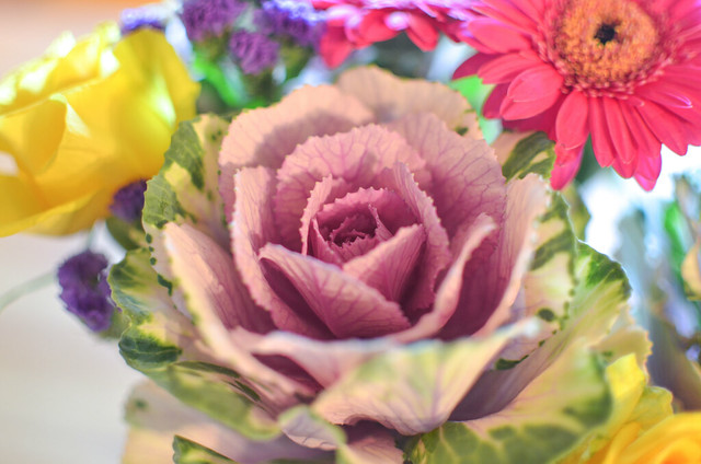
I do a lot of photography in my spare time and I love looking for colourful things to photograph. These palettes are all taken from my images over on Flickr here. Feel free to use these for inspiration in your own work and let me know if you come up with anything :)